
How to Prepare Artwork for Wall Graphics and Signage: A Guide for Designers
Artwork prepared for signage and large-format graphics has different technical requirements from artwork intended primarily for screens, conventional print or marketing documents. A file can look completely correct in Adobe Illustrator or another design application while still creating problems when it reaches RIP software, a large-format printer or a cutting system.
For designers, the objective is therefore not simply to supply a visually correct PDF. Production artwork needs to survive several stages of interpretation, scaling, printing, cutting, panel preparation and installation without introducing unnecessary uncertainty.
The following principles cover some of the most common issues we encounter when receiving artwork for wall graphics, window graphics, vinyl lettering and fabricated signage.
Key Takeaways
Convert fonts to outlines and expand relevant artwork strokes into shapes, but keep cutting paths as single stroked vector paths. Outlining a cutting path creates inner and outer contours that can result in a double cut.
Flatten artwork containing transparent PNG elements to reduce the risk of alpha-channel processing errors producing visible boxes or colour differences around raster images.
Supply artwork in CMYK, preferably as vector artwork at 100% finished size. Where artboard limits prevent this, use a clearly identified 10% scale.
Keep critical text, logos and other important elements away from finished edges. For wall graphics, allow approximately 100mm additional bleed at the bottom and right to accommodate walls, floors and ceilings that are not perfectly square or level.
Simplify clipping masks on custom-shaped and multi-drop graphics so production can create overlaps, joins and panel divisions without reconstructing the supplied artwork.
1. Convert Fonts and Strokes to Curves
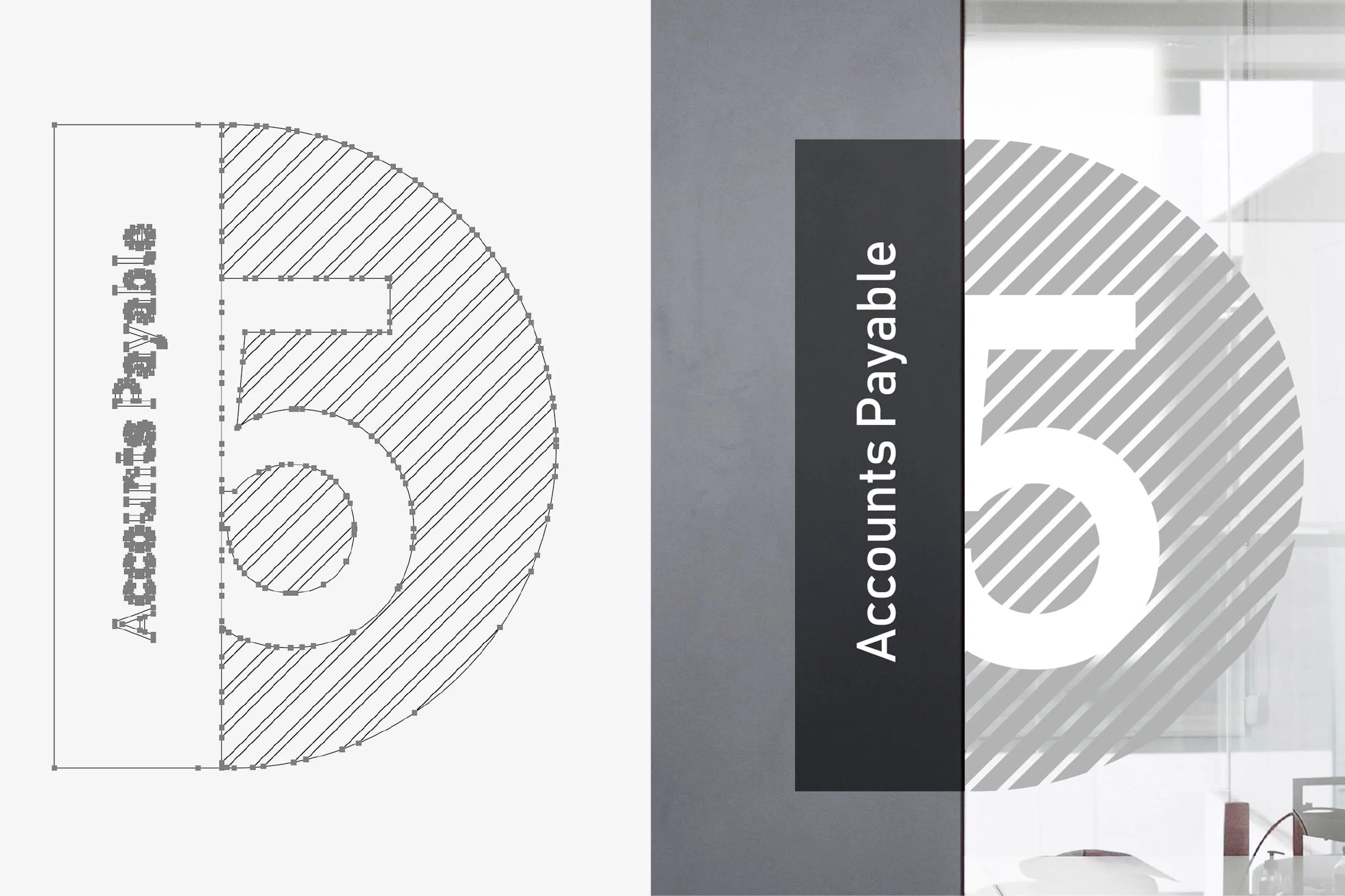
Before supplying final production artwork, all fonts should be converted to outlines. Decorative or visible strokes that form part of the printed artwork should generally also be expanded into shapes where their final appearance depends on the stroke weight.
Converting fonts to outlines removes dependency on installed or embedded typefaces and prevents font substitution when files pass through RIP or production software. Expanding ordinary graphic strokes similarly fixes their intended geometry rather than leaving another application to interpret their weight during scaling or processing.
Cutting paths are an important exception. Do not outline or expand a stroke that represents a cutting path. A cutting path should remain a single vector path with a stroke applied to it. Expanding that stroke creates inner and outer paths, which can cause cutting software to interpret the artwork as two separate cut lines and result in a double cut.
Where a dedicated cut contour is required, keep it as a clean single vector path and identify it clearly according to the production specification provided for the project.
And the FAQ answer should become:
Should strokes also be expanded?
Visible strokes forming part of the printed artwork should generally be expanded where their appearance needs to remain fixed during processing or scaling. Cutting paths must not be expanded or outlined. They should remain single stroked vector paths, as outlining a cut path creates inner and outer contours that may cause the plotter to cut the same shape twice.
2. Flatten Artwork Containing Transparent PNG Files
Transparent PNG files can create unexpected results in large-format printing workflows.
A PNG placed over another element may appear completely transparent within the designer’s application and exported PDF. However, some RIP workflows do not process alpha transparency in exactly the same way as the originating software.
One possible result is a visible rectangular area around the PNG. Instead of seeing only the intended transparent image, the printed output can contain a slightly darker or differently coloured box corresponding to the original image boundary.
This can be particularly noticeable across large areas of flat colour, where even a small difference becomes obvious once enlarged across a wall.
Where transparent PNG elements form part of the final composition, flattening the artwork before supplying the production file can reduce this risk. The transparency is resolved into the finished composition rather than being left for another piece of software to interpret later.
Again, keep the original layered artwork separately. Flattening should be part of preparing the production copy, not destroying the editable source file.
3. Avoid Excessive Clipping Masks on Custom-Shaped Graphics
Clipping masks are extremely useful during design, but complicated nested clipping structures can create difficulties when artwork needs to be prepared for physical production.
This is particularly important for custom-shaped wall graphics and installations produced across multiple drops.
Large graphics frequently need to be divided into separate sections according to material width, printing requirements and the practical installation sequence. Production artwork may therefore require controlled overlaps or joins between neighbouring drops.
An excessive number of clipping masks can make that process unnecessarily difficult. Artwork that visually appears to be one object may actually contain multiple nested masks, hidden elements and complex transparency relationships that prevent sections from being extended or reorganised cleanly.
Where custom shapes are required, simplify the final production artwork wherever possible. Resolve unnecessary masks, remove hidden objects and create clean, understandable vector geometry.
The goal is not to avoid clipping masks altogether. It is to avoid using them as a substitute for properly constructed final artwork.
4. Prepare Colour Artwork in CMYK
Large-format printers and their RIP software can often accept RGB artwork, and some printing workflows deliberately make use of RGB source data. However, CMYK remains the safer general format when supplying finished artwork for conventional signage and large-format print production.
Converting the artwork deliberately allows the designer to see how colours behave when moved from the much broader possibilities of an illuminated RGB display into a print-oriented colour space.
This is particularly relevant for very bright greens, blues and other highly saturated colours that may appear significantly different when printed.
Designers should also remember that CMYK values alone do not guarantee an exact physical colour match. Printer configuration, ink set, media, laminate, surface finish and colour profiles can all influence the finished result.
Where colour accuracy is particularly important, identify critical brand colours when submitting the artwork rather than assuming that an on-screen appearance will reproduce identically in print.
5. Keep Important Content Away From Finished Edges
Important text, logos, faces and other critical design elements should not sit immediately against the finished edge of wall graphics or other large-format installations.
Unlike a small printed sheet trimmed on a bench, wall graphics are fitted to real architecture. Walls, ceilings, skirting, floors and corners are not always perfectly straight, level or square. The installer may need to make small adjustments to maintain the best visual alignment across the complete installation.
If critical artwork sits only a few millimetres from an edge, there is very little tolerance available for those adjustments.
The safe area should be considered during the design stage. Background textures, photography and decorative elements can usually extend into areas likely to be trimmed, while important content should remain comfortably inside the finished dimensions.
This becomes increasingly important as the physical size of the graphic increases.
6. Provide Additional Bleed for Wall Graphics
Wall graphics require considerably more installation tolerance than conventional printed products.
As a practical production approach, we recommend approximately 100mm of additional artwork at the bottom and right-hand edges where the design allows. The exact requirement can vary according to the project, so designers should confirm it before preparing final files for unusual installations.
There is a practical reason for this arrangement.
Wall graphics are commonly installed progressively from left to right and aligned from the top. This establishes a consistent reference while gravity naturally helps the material hang downwards during application.
The building itself, however, may not cooperate quite as enthusiastically.
Across a large wall, the relationship between ceiling and floor can change noticeably. A ceiling, floor or adjoining wall can be out by tens of millimetres, and on some sites differences approaching 50mm are entirely possible.
Additional artwork gives the installer room to compensate. The graphic can be positioned and aligned appropriately before the excess material is trimmed at the bottom and final right-hand edge.
Without sufficient bleed, the installation becomes dependent on the building matching the artwork dimensions almost perfectly. That is rarely a sensible assumption.
7. Supply Vector Artwork at 100% Size Where Possible
Final signage artwork should preferably be supplied as vector artwork at the actual finished dimensions.
Working at 100% scale removes ambiguity. A 4,000mm-wide graphic should ideally exist as a 4,000mm-wide artboard, with all relevant dimensions corresponding directly to the intended finished product.
For extremely large graphics, software artboard limitations can make full-size artwork impractical. In those circumstances, artwork can generally be supplied at 10% scale, provided this is clearly identified.
Consistency matters. Avoid arbitrary scales such as 23.7% simply because the artwork happens to fit an existing document. A straightforward 1:10 scale is easy for production teams to recognise, verify and enlarge accurately.
Vector artwork is particularly valuable because paths, typography and graphic elements can be enlarged without losing resolution.
Raster imagery contained within the design is different. Placing a photograph inside a vector PDF does not make the photograph vector. Its effective resolution at the final output size still needs to be appropriate.
8. Check Every Element Before Submitting Final Artwork
A production artwork check is not the same as a design proofread.
When artwork is supplied as finished and approved, the production team can check technical matters such as dimensions, file construction, obvious resolution issues, cut paths and whether the file can be processed by the intended equipment.
What they cannot reliably determine is whether the design itself is correct.
A production operator cannot know that a logo was intended to sit 30mm further left, that two text blocks should align, that a photograph is the wrong version or that a department name contains an error.
Before submitting artwork, designers should therefore check alignment, spacing, spelling, dates, contact information, logo versions, image placement and the relationship between panels.
Do not rely on the production stage to become a second design approval process. If the supplied artwork contains a deliberate-looking decision, there may be no reason for somebody unfamiliar with the design to question it.
Think About Installation While Designing
The most useful change a designer can make when preparing signage artwork is to stop thinking exclusively in terms of the artboard.
A wall graphic eventually has to become physical material. It must fit through a printer, potentially be divided into drops, align with neighbouring sections and be applied to a wall that may not be perfectly square. Vinyl lettering needs paths that a cutter can interpret. Printed elements pass through RIP software before reaching the machine.
That production journey should influence how the artwork is constructed.
Clean vectors, outlined typography, resolved transparency, sensible safe areas, adequate bleed and straightforward file structures reduce opportunities for interpretation between design and installation.
What to Send With Your Artwork
A technically prepared file becomes considerably easier to process when accompanied by clear information.
Include the intended finished dimensions or scale, identify the relevant sign or wall location, and clearly name different artwork versions. Where multiple files correspond to a signage schedule, use consistent references so each file can be matched to the correct item.
If a particular colour is critical, identify it. If a custom cut path is required, make it unambiguous. If something unusual has deliberately been incorporated into the artwork, tell the production team rather than relying on them to infer the intention.
The less interpretation required at production stage, the lower the risk of misunderstanding.
Preparing Artwork for Grafiscape
Grafiscape checks supplied artwork from a production perspective before manufacture, but responsibility for the design content remains with the person supplying and approving the artwork. Our technical checks are intended to identify production issues, not to redesign or independently verify every creative decision within a finished file.
For designers working with us, the best production files are therefore deliberately straightforward: vector wherever possible, correctly scaled, converted to CMYK, with fonts and strokes outlined, transparency appropriately resolved, important elements protected from trim areas and sufficient bleed included for installation.
If a project involves an unusual shape, particularly large dimensions or a complex wall installation, discussing the artwork structure with us before finalising it can prevent unnecessary reworking later.
A few decisions made correctly at artwork stage can make the difference between a file that merely looks right on screen and one that moves cleanly through production, installation and into the finished environment.
Frequently Asked Questions
-
A print-ready vector PDF is generally preferred. Artwork should be supplied at 100% finished size where possible, or at a clearly identified 10% scale for dimensions exceeding the application’s artboard limits.
-
Yes. All fonts should be converted to outlines before final artwork is supplied. This removes dependencies on installed or embedded font files and prevents substitution or interpretation issues when artwork passes through RIP and production software.
-
Yes, particularly where strokes form part of lettering or graphic elements. Expanding strokes converts them into defined vector geometry and prevents changes to stroke weight during scaling or processing.
-
As a general production allowance, provide approximately 100mm of additional artwork at the bottom and right-hand edges. Wall graphics are typically top-aligned and installed progressively from left to right, allowing excess material to compensate for floors, ceilings and walls that are not perfectly level or square before final trimming.
-
Yes, but transparency can be interpreted differently by some RIP workflows. Where transparent PNGs are used within the final composition, flattening the production artwork can prevent unwanted boxes or tonal differences caused by alpha-channel processing.
-
Multi-drop wall graphics often need to be divided, extended or overlapped during production. Excessive or nested clipping masks can prevent clean creation of these joins and make otherwise straightforward artwork difficult to prepare. Custom-shaped artwork should therefore use clean, simplified vector geometry wherever possible.
-
Grafiscape can check supplied artwork for relevant technical production issues, but this should not be treated as a design or proofreading service. Alignment, spelling, dimensions, content, logo versions, image selection and other creative decisions should be checked by the designer before final artwork is approved for production.
