

Grafiscape or Graphiscape? A Name Shaped by Process, Perspective & the Spaces Between
Every company name starts as a working idea. Some arrive polished and confident. Others evolve quietly, shaped by use, intent, and repetition. GRAFISCAPE belongs to the second category. It did not begin as a branding exercise, but as a description of how we see visual communication in physical space.
Before it became a name, it was a way of thinking.
The word comes from two foundations. Graphics, the visible language of brands, signage, surfaces, and information. And scope, the wider field those graphics exist within, the architecture, the flow of people, the materials, lighting, acoustics, and the purpose of the space itself.
When those ideas merged, the result was not something literal or textbook correct. It became GRAFISCAPE, a condensed expression of visual landscapes rather than isolated visuals.
From Graphics to Environments
Traditional graphic work often focuses on individual outputs. A sign. A wall. A logo. A panel. But in real environments, nothing exists alone. A sign only works because of where it sits. A wall graphic only works because of the light, the distance, and the materials around it. Wayfinding only works when it understands how people move, pause, hesitate, and decide.
This is where the idea of scope became central.
GRAFISCAPE was formed around the belief that graphics should be designed as part of an environment, not added to it afterwards. The work starts before materials are chosen and finishes long after installation, when the space is being used daily by staff, visitors, customers, and the public.
That mindset shaped the company long before it shaped the name.
The Name, Simplified on Purpose
At some point, the more obvious spelling appeared in conversations and notes. Graphiscape. Correct. Logical. Safe.
And yet, it felt slightly too neat.
GRAFISCAPE removed a few letters and, in doing so, removed some rigidity. The shortened form felt more flexible, more architectural, less tied to the literal word “graphic” and more connected to spatial thinking. It became a name that suggested a landscape of visuals rather than a catalogue of printed outputs.
Importantly, this was not about being clever for the sake of it. It was about choosing a name that behaved the same way the company works. Understated, intentional, and confident enough not to explain itself immediately.
Graphiscape, The Other Side of the Same Idea
That said, graphiscape still matters.
In practice, it represents the same thinking from a different angle. It is how many people naturally interpret the word. It is how it sounds when spoken. It is how it appears in searches, notes, emails, and first impressions.
Rather than distancing ourselves from graphiscape, we embraced it as part of the ecosystem. The term fits comfortably alongside GRAFISCAPE because it describes the same philosophy. A visual landscape. A graphic environment. A considered relationship between design and space.
In that sense, graphiscape is not a mistake or a compromise. It is a parallel expression of the same idea, one that reinforces the meaning rather than diluting it. Whether someone arrives through GRAFISCAPE or graphiscape, the destination is the same.
Clear thinking. Physical environments. Purposeful design.
The Company Behind the Name
Grafiscape operates within the physical layer of branding. We work on projects where visual communication must function in real space, under real conditions, and for real people.
Our focus is interior branding, signage, and architectural graphics for commercial, workplace, hospitality, retail, and mixed-use environments. The work is rooted in precision, restraint, and clarity, with a strong emphasis on how each element contributes to the whole.
The name reflects that approach. GRAFISCAPE is not about surface-level decoration. It is about designing environments that guide, inform, and reinforce identity without overwhelming the space.
Interior Branding as a System
Interior branding is often misunderstood as wall graphics or logos applied to surfaces. In reality, it is a system. One that connects architecture, messaging, materials, and movement.
Our interior branding work includes environmental graphics, brand-led wall treatments, feature installations, and spatial storytelling. These elements are designed to work together, creating consistency without repetition and presence without noise.
Every decision considers viewing distance, lighting conditions, surface texture, durability, and how the space will be used over time. The goal is not to fill walls, but to give spaces a clear visual structure that supports the brand.
Wayfinding and Navigation
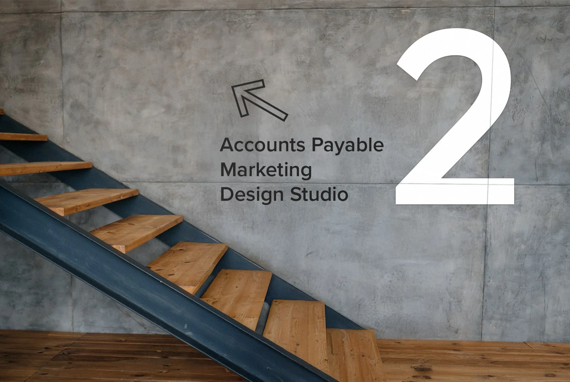
Wayfinding is one of the most practical expressions of the graphiscape idea. It sits directly at the intersection of graphics and spatial understanding.
Effective wayfinding signage does not shout. It anticipates behaviour. It appears exactly when needed and disappears when it is not. Typography, contrast, placement, and hierarchy all matter, but so does the building itself.
We design wayfinding systems that respond to architecture rather than fight it. This includes directional signage, floor and wall indicators, identification signs, and integrated information systems that feel like part of the space from day one.
Illuminated and Built-Up Signage
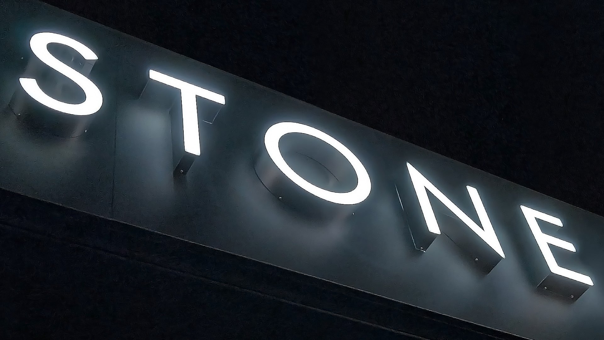
Illuminated signage plays a different role indoors than it does externally. It is often about presence rather than visibility from a distance. Used correctly, illuminated and built-up letters can anchor a space, mark key areas, or introduce a brand in a calm but confident way.
Our work in this area includes halo-lit letters, face-lit signage, feature logos, and bespoke illuminated elements designed specifically for interior use. The emphasis is always on balance, light intensity, colour temperature, and integration with surrounding finishes.
The result is signage that feels architectural, not applied.
Architectural Vinyl and Surface Transformation
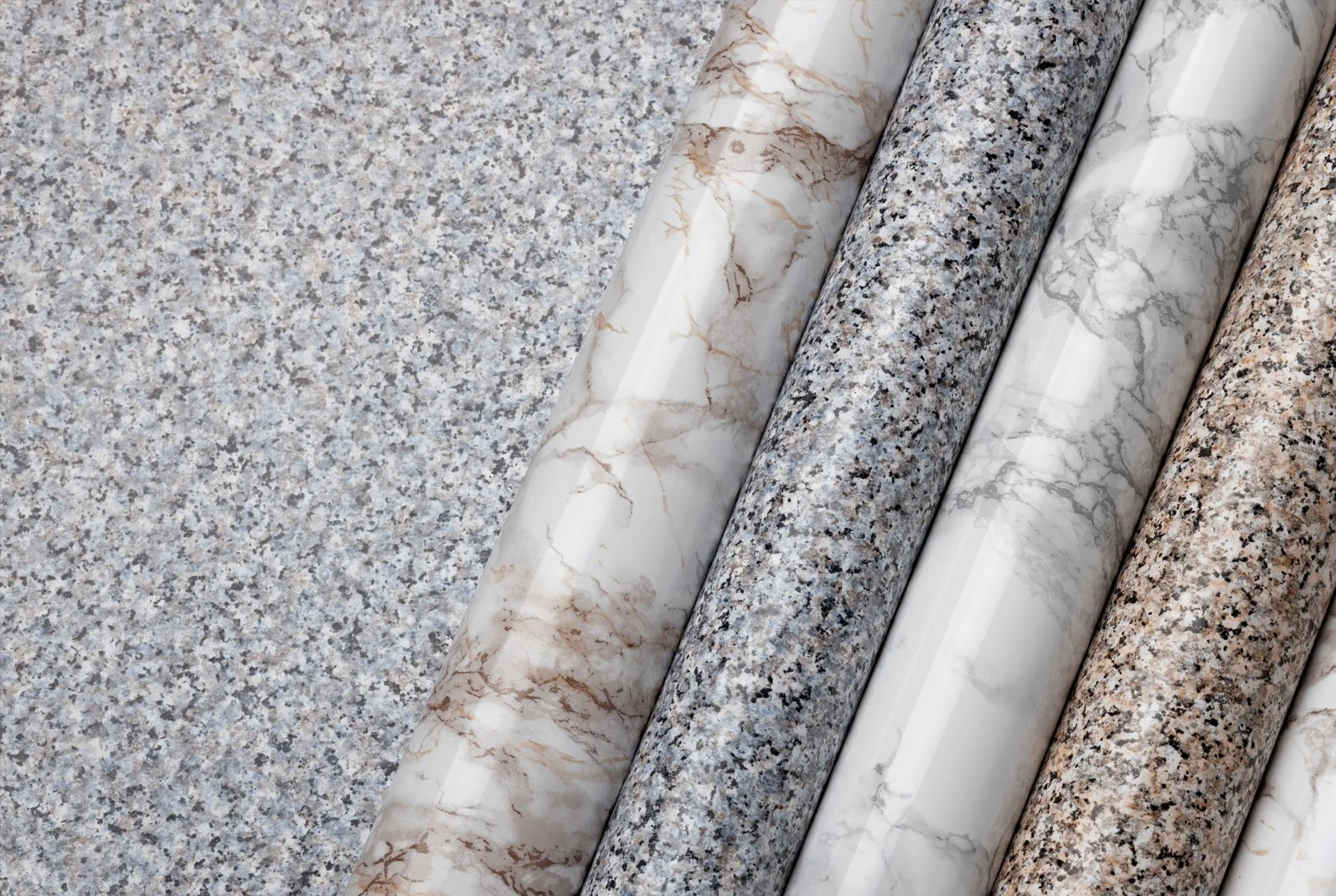
Architectural vinyl allows spaces to be refreshed, adapted, or redefined without structural change. Used strategically, it becomes a powerful tool within interior branding and spatial design.
We apply architectural vinyl to walls, columns, lifts, doors, counters, and other surfaces to introduce texture, colour, pattern, or branding elements. This approach is particularly effective in occupied buildings, where disruption needs to be kept to a minimum.
Within the GRAFISCAPE philosophy, vinyl is not a shortcut. It is a considered material choice that allows flexibility, longevity, and precision.
Acoustic and Decorative Elements
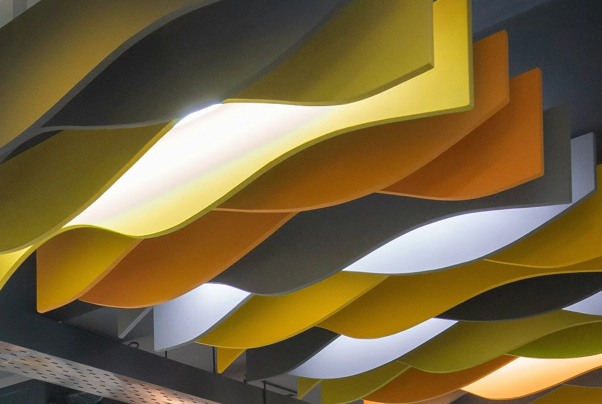
Sound is an invisible part of every environment. In workplaces and public interiors, poor acoustics can undermine even the best visual design.
We incorporate acoustic panels, felt systems, ceiling baffles, and decorative acoustic elements that address sound control while supporting the overall visual language of the space. These elements are selected and positioned with the same care as any graphic or signage component.
This is another area where the idea of graphiscape becomes tangible. Visual comfort and acoustic comfort are part of the same experience.
A Name That Grows With the Work
As the company has developed, the name GRAFISCAPE has proven flexible enough to grow with it. It does not lock the business into a narrow category or a single output. It allows for expansion across interiors, signage, graphics, and spatial branding without contradiction.
At the same time, graphiscape remains a useful and accurate descriptor of what we do. It reflects how people naturally think about graphics within environments. It supports search visibility. It reinforces the meaning rather than competing with it.
Together, GRAFISCAPE and graphiscape form a complete picture. One is the name. The other is the explanation.
GRAFISCAPE is not a name designed to be decoded instantly. It makes more sense when experienced through the work itself. Through spaces that feel organised, legible, and intentional. Through environments where branding supports function rather than distracting from it.
The story behind the name mirrors the way we approach projects. Thoughtful, slightly unconventional, and grounded in real-world use rather than theory.
Graphics with scope.
Scope shaped by space.
A graphiscape, expressed as GRAFISCAPE.