

What to Consider When Designing a Foliage Wall with Illuminated Letters

Foliage walls with illuminated letters are one of the most impactful interior branding features available today. They combine natural texture with high-visibility signage, creating an aesthetic that feels both inviting and deliberate. These installations are increasingly popular in reception areas, retail environments, hospitality spaces, and showrooms , and for good reason. They do more than decorate. They communicate identity, improve spatial atmosphere, and guide attention to key zones.
But while they may appear straightforward, a successful foliage wall installation involves more than simply choosing a light-up sign and adding greenery behind it. It requires clarity of purpose, spatial awareness, brand alignment, and technical foresight. Each decision , from lighting type to foliage density , plays a role in how the final piece looks, feels, and performs.
Before commissioning or designing your own foliage wall with illuminated letters, there are several key considerations to explore. Below, we break down the critical elements that contribute to a successful, brand-aligned installation.
Understand the Purpose Behind the Feature
The first step in any successful installation is to understand the intent behind it. Not all foliage walls serve the same purpose. Some are statement pieces designed to draw immediate attention. Others are meant to enhance ambience while quietly reinforcing brand presence. Some act as wayfinding elements, others as social backdrops.
Clarifying the purpose will influence decisions around lighting intensity, scale, content, positioning, and even foliage selection. A bold, high-contrast illuminated logo may be perfect for a retail entrance, while a subtler backlit tagline might be more suitable for a hospitality lounge.
Consider how visitors will interact with the space. Will they view the wall from a distance, or walk past it closely? Will they stop in front of it or simply absorb it in passing? Will it need to be legible under natural daylight, or operate primarily in evening lighting? Each of these factors helps define design intent.
Choose the Right Type of Illumination

Illuminated letters come in several styles, each offering a different visual effect and impact level. Understanding these options is essential when matching the installation to the brand tone and setting.
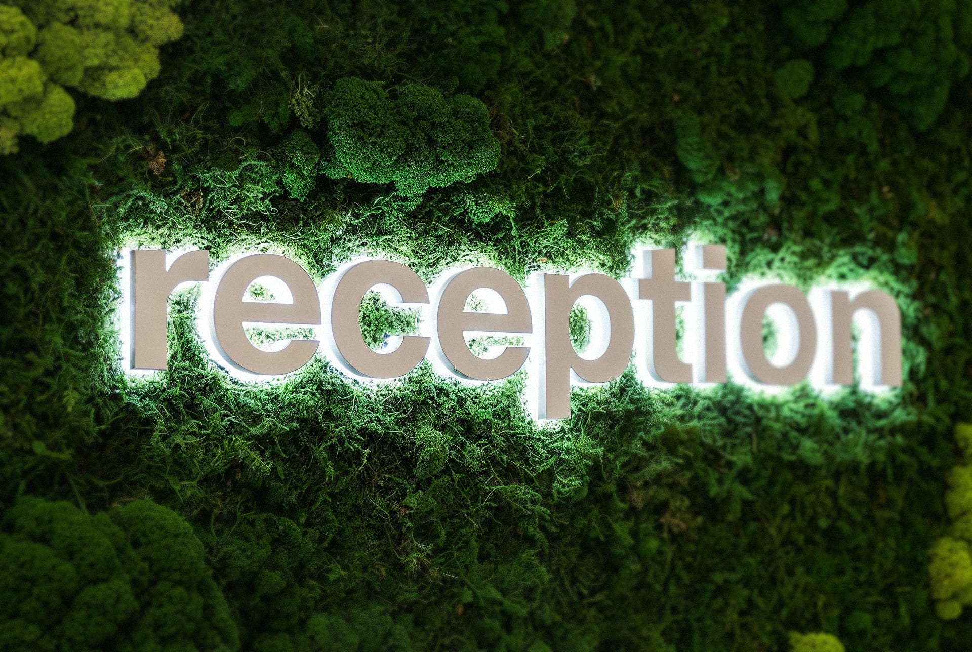
Backlit Letters create a subtle halo around each character, delivering a sophisticated and elegant glow. Ideal for premium environments like office receptions or wellness spaces.
Face-Lit Letters illuminate from the front, offering bold visibility and high impact. Commonly used in retail, events, or high-traffic public areas.
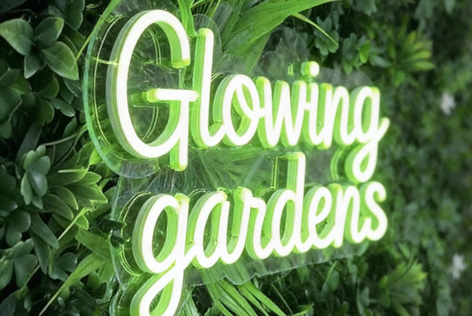
Neon-Style Letters deliver a playful, expressive energy suited to lifestyle brands, food and beverage venues, or creative studios.
Each lighting approach supports a different mood. Backlighting suggests calm and control. Face-lit designs express confidence and clarity. Neon feels expressive, dynamic, and youth-focused. Selecting the right lighting style means aligning visual impact with brand personality.
Select Artificial Foliage That Complements, Not Competes
The choice of greenery behind or around the letters matters as much as the letters themselves. Foliage acts as a visual texture and background canvas, but it also influences how the lighting is perceived. Too much contrast can overpower the signage. Too little texture can flatten the space.
Choose foliage based on brand tone, spatial size, and the emotional response you wish to evoke. Deep green boxwood creates a formal, uniform backdrop. Mixed ferns and tropical varieties suggest vibrancy and a more relaxed identity. Lighter or dusted foliage can brighten darker environments. Custom colour blends can also be used to match specific brand palettes.
It’s important to consider how lighting will interact with the foliage. Glossy or heavily layered textures may reflect or scatter light in unpredictable ways. Matte or slightly textured finishes often work best when paired with illuminated lettering.
Sizing, Scale, and Proportions

One of the most common pitfalls in foliage wall design is getting the scale wrong. Oversized letters on a compact wall can feel crowded. Undersized signage on a large wall loses visibility. Balancing proportion is key.
Spacing is just as important as letter size. Illuminated signage needs room to breathe. Crowding the text or placing it too close to the edge of the greenery diminishes legibility and visual clarity.
The ideal layout allows negative space around each element, giving both the foliage and the lettering room to be seen. This also helps when the installation is photographed , an increasingly important factor in commercial and retail environments.
Plan for Power Access and Infrastructure
Illuminated signage, regardless of style, needs safe and reliable electrical access. Many installations are held back by late-stage planning where wiring becomes complicated or unsightly.
Early planning allows cables, transformers, and power units to be hidden behind panels, inside wall cavities, or within custom-built frameworks. Low-voltage LED systems are common and energy-efficient, but still require compliance with safety regulations. For installations in live environments, planning installation times to avoid operational disruption is also important.
Power planning isn’t just about safety or aesthetics , it affects overall feasibility. Without proper routing, a clean, cable-free finish may be impossible.
Consider Viewing Angles and Light Levels
How a foliage wall is seen determines how it should be designed. An installation viewed head-on from a reception desk has different design requirements than one seen from a corridor, staircase, or open-plan office.
Natural light can affect the intensity and clarity of illuminated letters. If the wall receives strong daylight, especially from windows or skylights, the lighting may need to be brighter or paired with higher-contrast materials. In low-light spaces, softer or ambient LED options may suffice.
Think also about movement. Will people see the wall while walking, or will they stop in front of it? Is the wall part of a linear space or viewed from multiple angles? A strong design considers not just where the wall is, but how it lives in the space.
When to Use Lettering for More Than Logos
Illuminated letters don’t have to stop at logos. Foliage walls can carry taglines, mission statements, directions, or calls to action. This is particularly effective in larger spaces or multi-zoned interiors where messaging becomes part of the navigation or brand story.
Consider using built-up lettering to add a tactile layer, or layering cut vinyl onto acrylic for a dimensional effect. In more expressive interiors, combining neon lettering with artificial greenery creates Instagram-friendly photo backdrops , useful in hospitality and events.
Keep messaging minimal for clarity. A short phrase, single word, or icon often makes more impact than full sentences.
Integrate the Wall into the Broader Interior Scheme
A foliage wall should never feel like an afterthought. It works best when part of a larger interior branding plan. Matching or echoing textures, colours, and design language elsewhere in the space helps create cohesion.
Pair your foliage signage with:
Branded reception desks or feature counters
Ceiling baffles or acoustic panels in complementary tones
Wayfinding signs that use the same font, colour, or lighting style
This consistency helps reinforce brand presence across the space without repeating the same design elements.
Summary: Key Factors to Get Right
Designing a successful foliage wall with illuminated letters is equal parts aesthetic and strategic. Here are the core areas to focus on:
Define the purpose of the wall early in the project
Choose a lighting style that reflects the tone of the brand
Select foliage that supports visibility, tone, and texture
Scale lettering appropriately for the space and audience
Plan electrical access and installation logistics in advance
Consider how the wall will be viewed and under what lighting conditions
Use lettering creatively to go beyond logos when needed
Integrate the wall into your wider interior brand system
By taking time with each of these elements, your foliage wall becomes more than décor , it becomes a functioning brand asset.
At Grafiscape, we design and install foliage wall systems that merge brand, texture, and light into one cohesive feature. Whether you're planning a full interior fit-out or a single feature wall, we help turn your vision into a practical, long-lasting visual statement.
Contact us to discuss your project or request a tailored consultation.