

10 Business Signage Design Principles That Improve Visibility and Readability
Effective signage is not judged by how it looks in a presentation. It is judged by how quickly people understand it in a real environment.
The strongest signage systems usually appear simple, but that simplicity is the result of deliberate decisions around readability, placement, hierarchy, contrast, and environment. A sign only works when people notice it, understand it, and react to it without effort.
Many signage problems begin long before production. The design may feel visually refined on screen but fail once installed because the typography is too small, the contrast disappears under lighting conditions, or the message competes with too much surrounding information.
At Grafiscape, signage design is approached around performance first. Visual quality matters, but only if the sign functions properly once it enters a physical space.
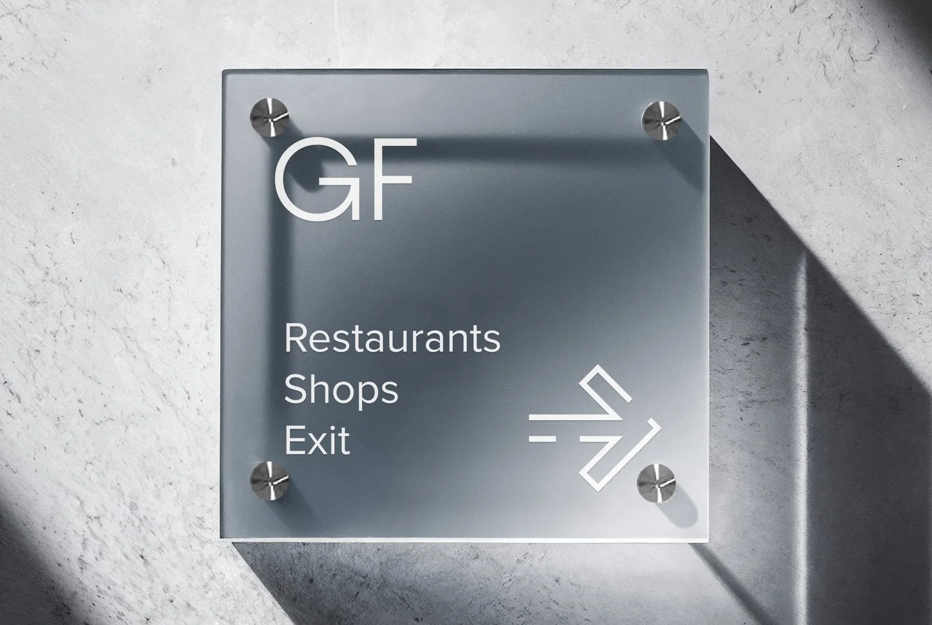
1. Clear Messaging Improves Sign Recognition
The shorter the message, the faster the sign can be understood.
Most people interact with signage while moving through a space rather than standing still. A shop sign, directional sign, or wayfinding panel often has only a few seconds to communicate its purpose before the viewer moves on.
This is where many businesses overload the design. Service lists, taglines, contact details, and promotional copy are all added into the same layout, reducing clarity instead of improving communication.
A stronger approach is to define one primary objective per sign. A fascia sign identifies the business. A directional sign guides movement. A promotional sign highlights an offer. Once that role is clear, unnecessary information becomes easier to remove.
2. Readability Matters More Than Decorative Typography
Readable signage performs better than stylish signage that requires effort to process.
Typography behaves differently in signage than it does in branding or print design. A font that looks refined on a website may become difficult to read once viewed from distance, at an angle, or under changing lighting conditions.
Clean sans-serif typefaces generally perform best because they maintain clarity in real environments. Letter spacing, line height, and hierarchy also affect readability far more than most businesses realise.
On a recent office branding project, a muted grey-on-grey directional system initially approved on screen became difficult to distinguish once installed under cool fluorescent lighting. The issue was not the typography itself, but the loss of visual separation created by the environment.
That adjustment only became obvious once the signage was tested within the physical space.
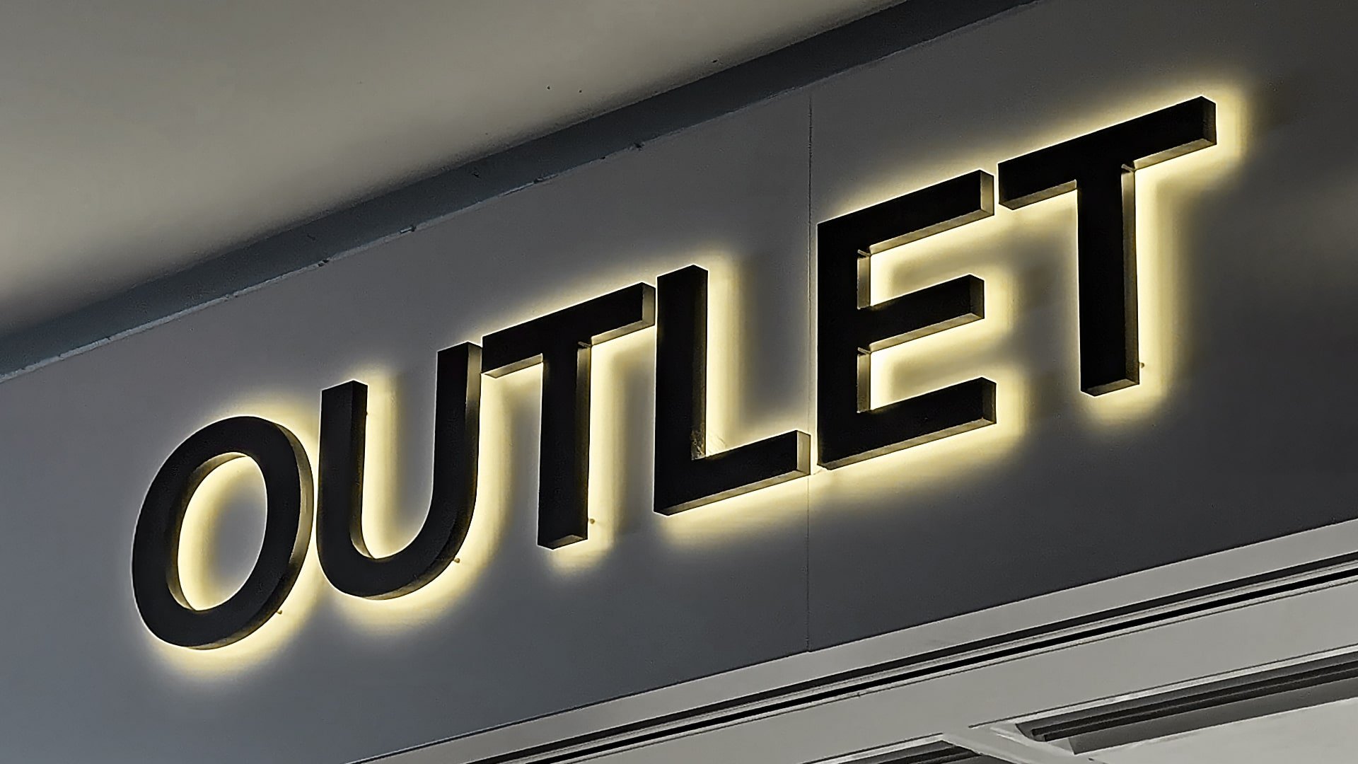
3. Strong Contrast Increases Visibility
High contrast improves signage visibility by separating text clearly from its background and surrounding environment.
This applies both to the sign face itself and to the wall, glazing, or surface behind it. A sign with weak contrast may technically contain readable information while still failing to attract attention.
Modern interiors often create this problem unintentionally. Neutral palettes, reflective materials, and textured finishes can reduce visibility even when the design itself appears balanced in artwork form.
Good contrast does not necessarily mean bright colours. It means controlled separation between information and environment so the sign remains visible throughout different lighting conditions.
4. Viewing Distance Should Control the Design
Viewing distance determines how large text needs to be, how much information can fit comfortably, and how quickly the sign can be processed.
This directly affects:
letter height
spacing
amount of wording
layout density
One of the most common mistakes in signage design is reducing text size simply to fit more content into the available space. In practice, this often makes the sign unreadable from its intended viewing position.
A sign viewed from across a corridor behaves differently from one viewed across a road or from a moving vehicle. The design should always begin with how the sign will actually be seen.
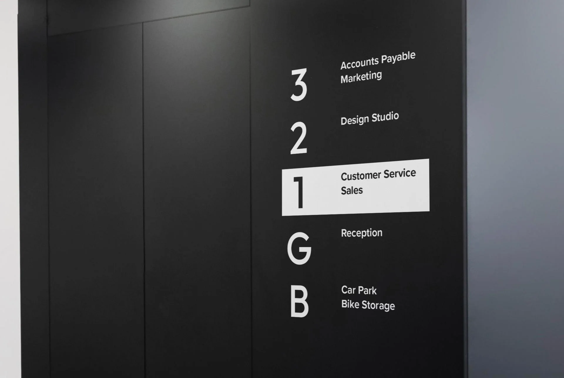
5. Simple Layouts Improve Information Hierarchy
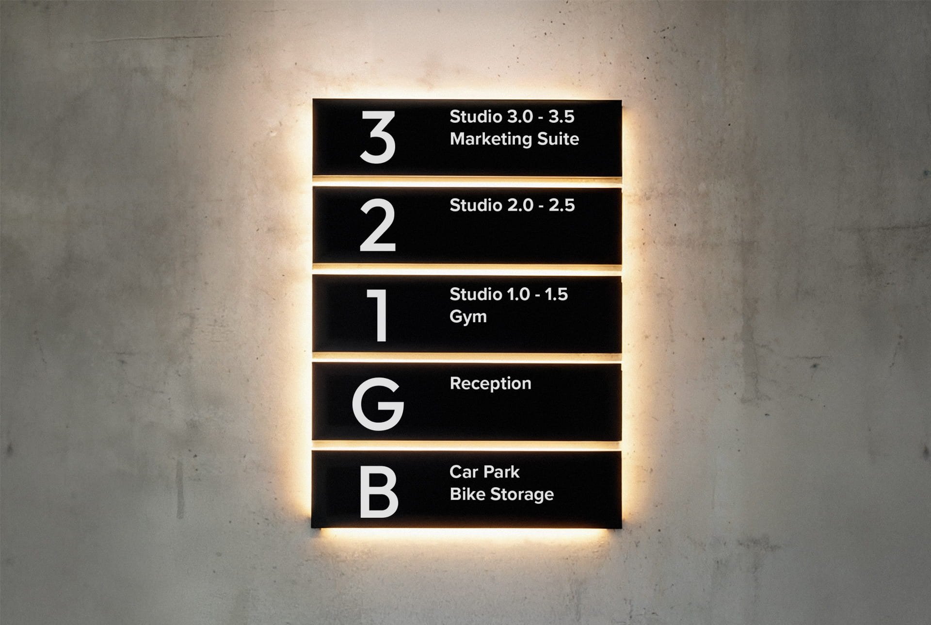
Simple signage layouts improve recognition speed because viewers understand what to read first without needing to interpret the structure.
Hierarchy controls attention. It defines which message is primary, which information supports it, and how the eye moves across the sign.
When layouts become overloaded with competing text sizes, multiple colours, or excessive graphic elements, recognition slows down immediately.
In many cases, removing elements improves signage more than adding new ones. The strongest signs usually communicate less, not more.
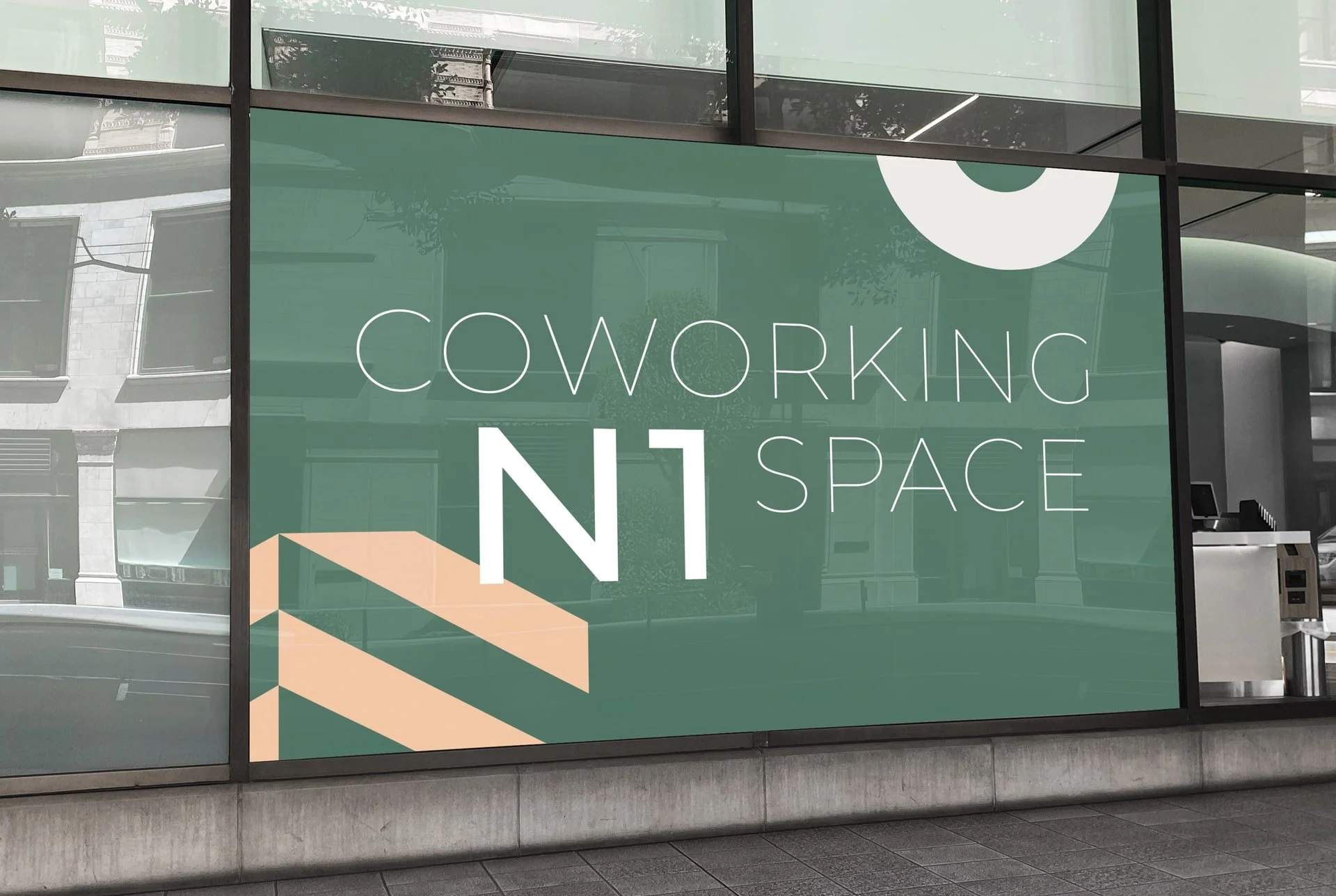
6. Consistent Branding Builds Familiarity
Consistent signage design strengthens brand recognition across multiple touchpoints.
Most businesses use more than one sign type, shopfront signage, window graphics, wall branding, wayfinding systems, and promotional displays all operate together within the same environment.
Without consistency, these elements begin to feel disconnected. Typography, finishes, colours, and graphic style should align so the signage system feels intentional rather than assembled over time.
At Grafiscape, this structure is normally established before production begins. Once inconsistency enters the environment, future signage additions become increasingly difficult to integrate cleanly.
Consistency does not mean repetition. It means maintaining a recognisable visual language across the space.
7. Environmental Conditions Affect Sign Performance
Lighting, reflections, weather, surrounding colours, and architectural materials all influence how signage performs after installation.
A sign that works perfectly in a digital proof may disappear completely once placed against reflective glazing or exposed to direct sunlight.
External signage must account for UV exposure, rain, nighttime visibility, and viewing distance. Interior signage must respond to movement flow, lighting temperature, and material finishes within the space.
On a recent retail project, a polished acrylic wall sign produced excessive glare from nearby downlights, reducing readability during peak daylight hours. The solution was not redesigning the branding itself, but adjusting finish selection and positioning to control reflection.
This is why signage should always be assessed within the environment it will actually operate in.
8. Accessible Signage Improves Usability
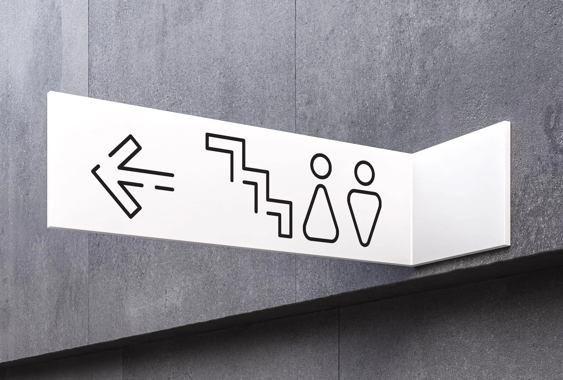
Accessible signage improves usability for everyone, not only for regulated public environments.
Sentence case typography, clear symbols, logical grouping, and straightforward wording all improve how quickly people process information. By contrast, ALL CAPS reduce readability, centred paragraphs slow scanning, and excessive abbreviations create confusion.
Accessibility becomes even more important within wayfinding systems, healthcare environments, offices, and public-facing buildings. Depending on the project, this may involve tactile lettering, Braille elements, contrast standards, or placement requirements.
A sign only works when people can understand it comfortably without needing to stop and interpret it.
9. Sign Placement Is Part of the Design Strategy
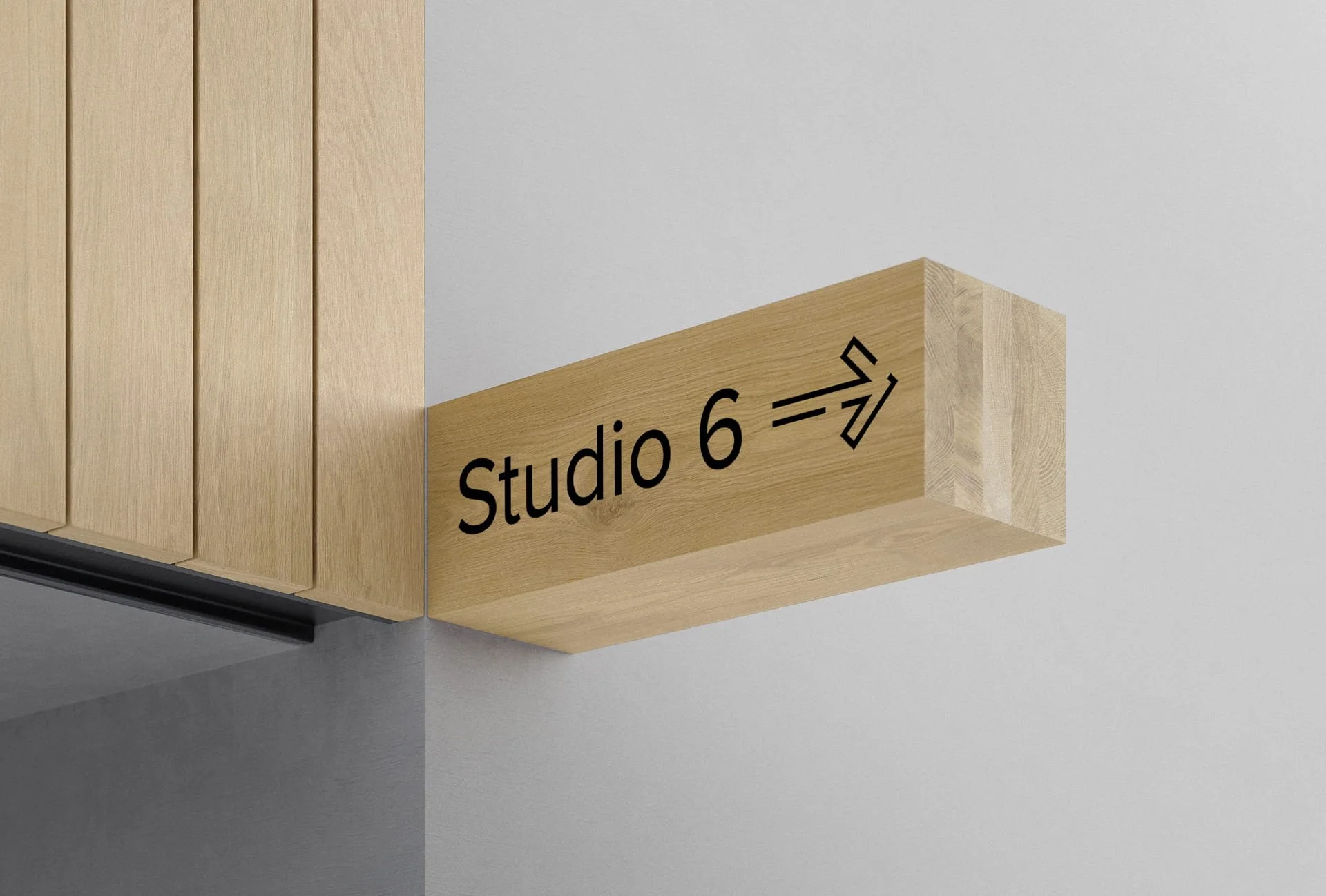
Sign placement directly affects whether information is noticed at the right moment.
Signs should appear where people naturally expect information to exist, based on movement flow, eye level, and viewing direction.
A directional sign installed too late forces hesitation. A fascia sign positioned too high loses pedestrian visibility. An internal sign hidden behind glazing or furniture becomes ineffective regardless of how well it was designed.
At Grafiscape, placement is reviewed alongside viewing angles and movement patterns before sizing and production are finalised. This prevents performance issues from being discovered after installation.
10. Testing in Real Conditions Reveals Problems Early
Signage should always be tested from the viewer’s perspective rather than the designer’s perspective.
Scale behaves differently in physical space than it does on a monitor. Lighting changes colour perception. Distance changes readability. A layout that feels balanced digitally may become overcrowded once installed.
Testing within real conditions often reveals issues that are impossible to identify during the artwork stage, particularly around hierarchy, contrast, glare, and information density.
Many long-term signage problems begin because approval decisions were made entirely on screen.
Where Business Signage Usually Starts to Fail
Most signage failures are not caused by fabrication quality. They begin during design decisions.
A common example is prioritising aesthetics over readability. The sign looks visually impressive during presentation stages but becomes difficult to process in real conditions.
Another issue is designing signage independently from the environment around it. Typography, finishes, and colours may all appear correct individually while failing collectively once installed within the actual space.
The problem is rarely one major mistake. More often, it is the accumulation of smaller compromises that reduce performance over time.
Designing Signage That Performs Beyond Installation Day
Good signage should continue working long after installation, not just during approval stages.
That requires readability, placement, accessibility, hierarchy, and environmental performance to function together rather than independently. When these elements align, signage becomes easier to notice, easier to understand, and more effective at supporting the brand behind it.
At Grafiscape, signage design is developed around how people experience the sign within real environments, not simply how the artwork appears in isolation.
Many signage problems only become visible after installation. Grafiscape assesses readability, placement, hierarchy, and environmental performance before production begins, helping businesses avoid costly redesigns later.
-
A business sign is easiest to read when it uses clear typography, strong contrast, simple wording, and appropriate letter sizing for the viewing distance. Overly decorative fonts, crowded layouts, and weak contrast usually reduce readability significantly.
-
Clarity is the most important factor in signage design. A sign should communicate its message quickly without requiring effort from the viewer. Good signage prioritises readability and recognition before decorative styling.
-
Letter size depends on how far away the sign will be viewed from. Signs designed for roadside visibility require much larger lettering than signs viewed at pedestrian distance or within interior spaces.
-
Contrast determines how visible a sign is against its background and surrounding environment. Strong contrast helps viewers recognise and process information quickly, particularly in busy commercial spaces or changing lighting conditions.
-
Yes. Signage should align with the company’s branding through consistent typography, colours, finishes, and visual style. Consistency improves brand recognition and helps different signs feel connected across the environment.
-
Common mistakes include using too much text, choosing hard-to-read fonts, ignoring viewing distance, poor placement, weak contrast, and designing signage without considering the surrounding environment.
-
Placement affects whether people notice and understand the sign at the right moment. Even well-designed signage becomes ineffective if positioned too high, too late within a route, or outside natural sightlines.
-
Lighting can change how colours, contrast, and materials appear after installation. Reflections, glare, shadows, and direct sunlight can all reduce visibility if they are not considered during the design stage.